Brand Design | Web Design | App Design
BeeLingual


All the Buzz
Beelingual After School Language Program is a comprehensive language learning experience for elementary students. In order to promote language proficiency, global awareness, and lifetime friendships, it provides a wide variety of languages, interesting and interactive sessions, and a thorough cultural immersion. Small class sizes and qualified instructors guarantee individualized attention and the growth of confident language skills.


Branding
I wanted to create something enjoyable while maintaining a stable learning program's foundation. The shape of the bee symbolizes communication and conversation without defining a specific language. The name BeeLingual further conveys the brand's playfulness and vibrant colors.

Honeycomb Gold
HEX: #FFCA42
RGB: 255, 202, 66
CMYK: 0%, 21%, 74%, 0%
Pantone: 7607 C
Dark Hive
HEX: #2C1B17
RGB: 44, 27, 23
CMYK: 0%, 39%, 48%, 83%
Pantone: 4975 C
Blossom Nectar
HEX: #F87BAB
RGB: 248, 123, 171
CMYK: 0%, 50%, 31%, 3%
Pantone: 4975 C
Lavender Pollen
HEX: #C592F7
RGB: 197, 146, 247
CMYK: 20%, 41%, 0%, 3%
Pantone: 2645 C
Heading
Ubuntu
Bold
ABCDEFGHIJKLMNOPQRSTUVWXYZ
abcdefghijklmnopqrstuvwxyz
Clover Leaf
HEX: #D2EFD9
RGB: 210, 239, 217
CMYK: 12%, 0%, 9%, 6%
Pantone: 621 C
Heading
Ubuntu
Regular
ABCDEFGHIJKLMNOPQRSTUVWXYZ
abcdefghijklmnopqrstuvwxyz
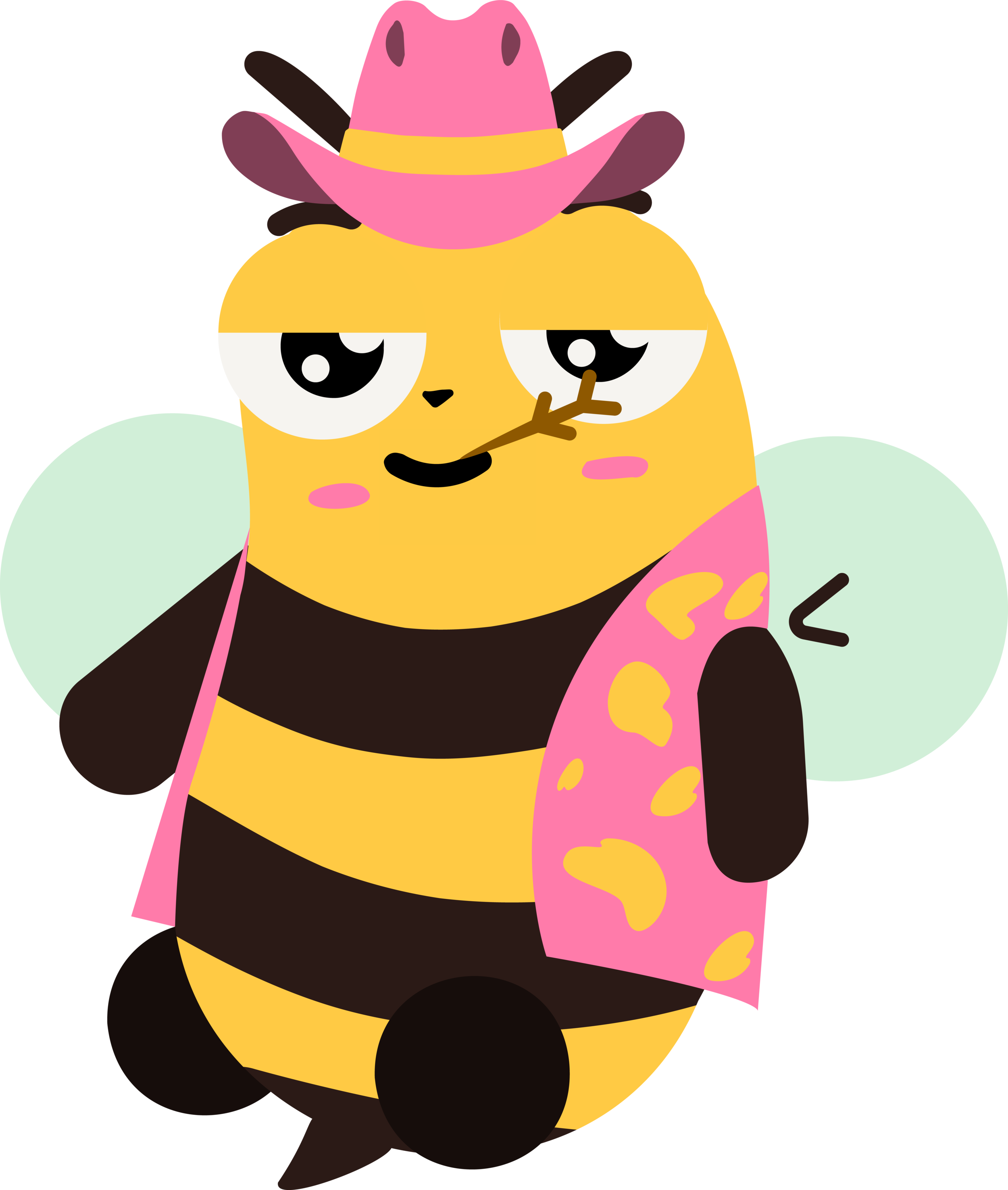
Bea The Mascot
This is Bea! They are the face of the app and a guide for children to look up to. Bee helps keep the fun element for the children. They are also a foundation of friendliness that parents would look up to and trust.
The six costumes below are supposed to be an incentive for children to "buy" with the fake money they can only obtain through the app. Why those specific costumes? I asked all of my friends and little sister what they wanted to do when they grew up as a kid. These are some of the answers I got and I think it captures a small essence of what it means to be a kid.


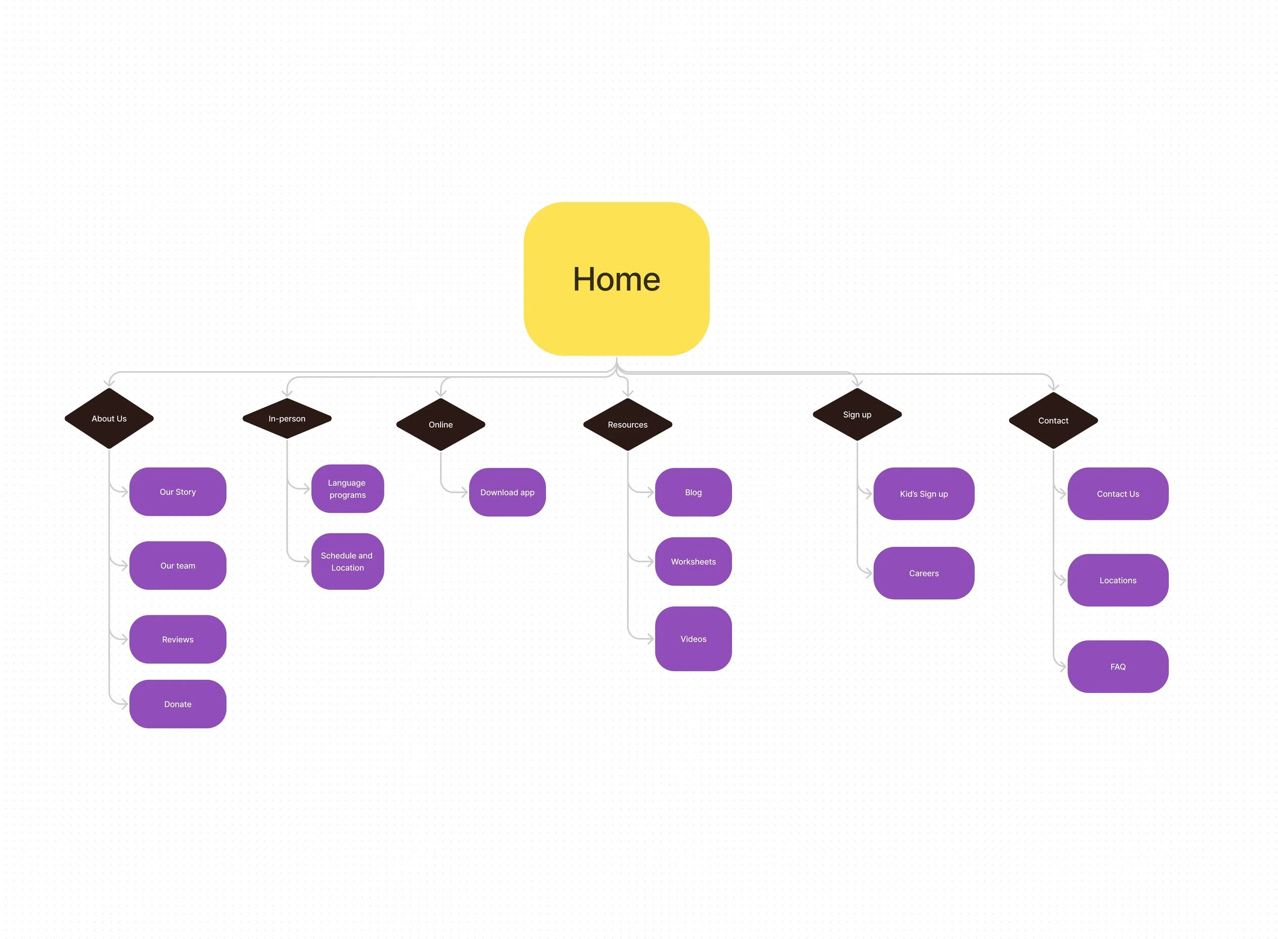
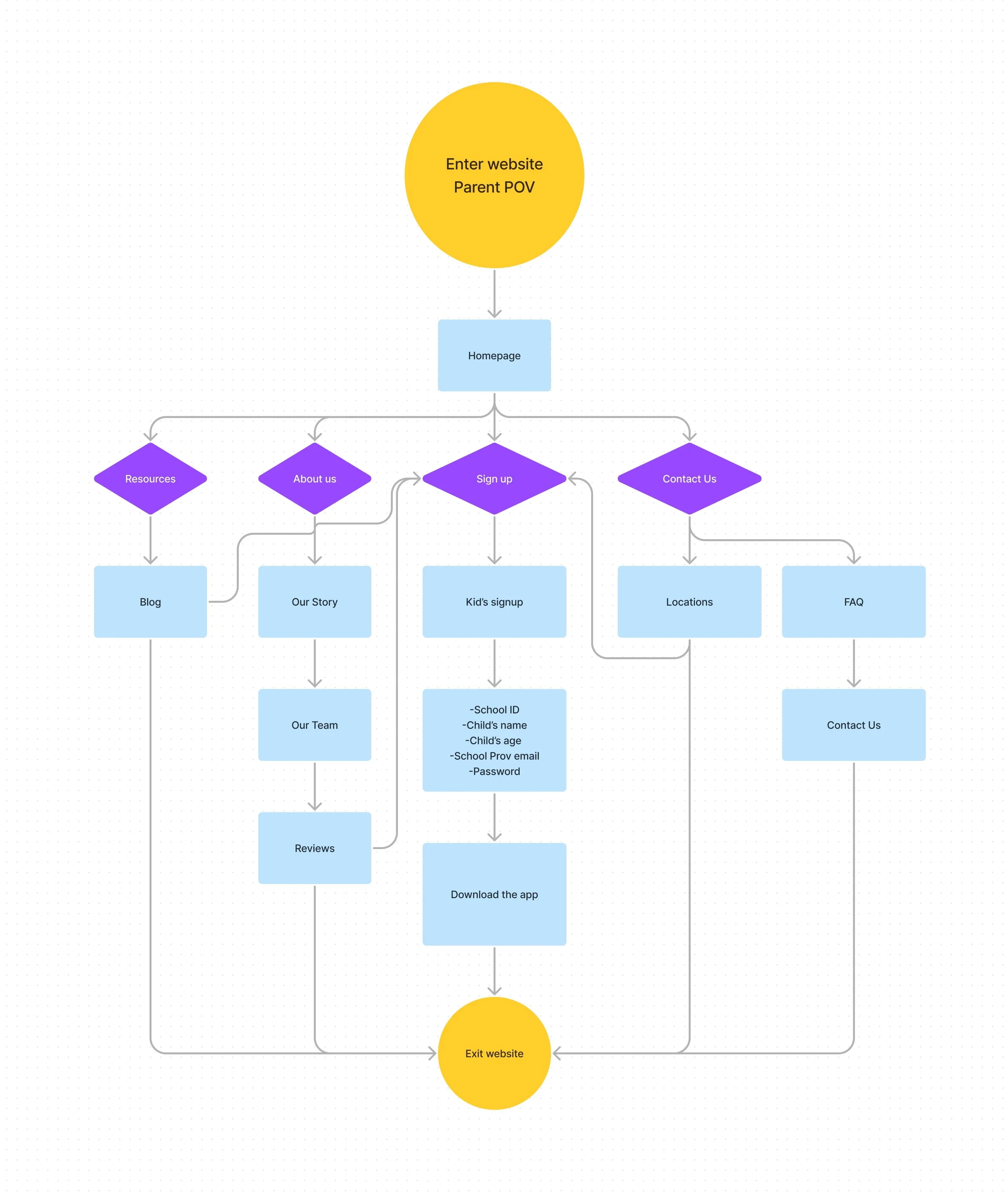
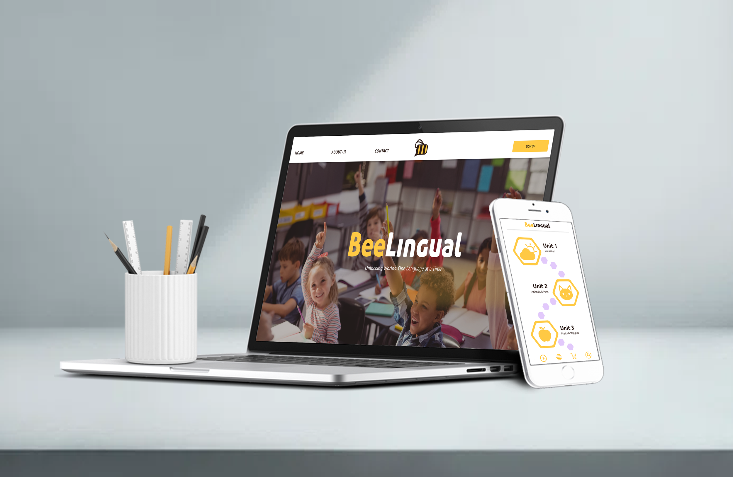
Website
Application
My Process
A big guidance to this project is thanks to my little sister who was part of my audience. I would invite her and her friends and test all of our mascots to see which one they believe is the most friendly. Surprisingly the third one was chosen but when applied to a website we noticed a lot less engagement with the outlined bee which made me ultimately choose the no outlined bee. No regrets!


This step was very important to layout and get in the parents' shoes. How much information should it be displayed? What would parents love to see? All of these questions were the foundation of this step that lead me to a more conservative website which I think worked nicely considering my audience.